Compass Explorer experience update

Interface glow-up: Explorer has been given both a fresh coat of paint and some UX love and should now be a more pleasant experience for all our users, including folks who are browsing the inventory on mobile devices. The iconography across the tool has also been updated to a more modern library.
Pinning instead of bookmarking: Users now will "pin" resources rather than "bookmark" them. Same feature, new name, but one that aligns closer to what the feature actually does. Plus, it maps to terminology common in productivity apps, such as Outlook, creating a more intuitive experience for all.
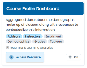
Refreshed card layout: The layout of the resource cards has been updated to bring more focus to the name of the resource as well as highlight the available actions for a given resource. Tags have been grouped together, the office responsible for creating the resource is now listed with tags, and the bottom of every card features the buttons to access the resource or pin/unpin it. Here's the new card layout:

Updated nav bar: The bar across the top of Explorer now features a "Resources" menu, providing quick access to the data request form and the UCI Compass website.
Refreshed home page: The updated homepage features links to the Compass website, the data request form, and the MAPSS program.
Resource intake form: Do you have a resource you want included in Explorer? Email me or fill out this form and we'll get the process started: https://forms.microsoft.com/r/5ggwPWr6f9
Updated error pages: Hopefully a user will never see these, but we also refreshed the error pages that can occur in the event of a system failure. The new pages are more useful and better match the look and feel of the new tool.
Less exciting but still important framework updates: Explorer now uses common frameworks used by other SST tools, continuing our commitment to operational efficiency and enhancing ongoing maintainability of the tool going forward. (For the technical and/or curious folks, Explorer now uses Tailwind CSS + Daisy UI for the front-end and FontAwesome for the iconography, bringing it into alignment with our modern tools).
Check out all the updates and explore the resources available at https://explorer.compass.uci.edu/.
