Reading the Outcome Gap Dashboards
Review the Research
The COMPASS Grade Equity Dashboards are based on research done at UCI and published in the PLOS ONE journal: Identifying systemic inequity in higher education and opportunities for improvement (Denaro, K.; Dennin, K.; Dennin, M.; Sato, B.)
How to Use
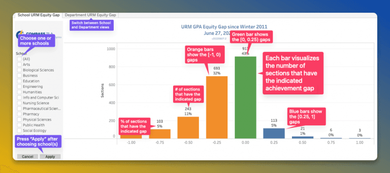
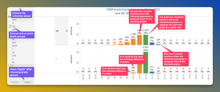
The COMPASS Grade Equity Dashboards use Tableau, and work differently than the other COMPASS reports that you might be familiar with. These annotated screenshots outline how to use the features in Tableau to use the dashboards, as well as explain how to read the data in the dashboards.
How to use the GPA equity gap dashboard & read the data

How to use the grade equity gap dashboard & read the data

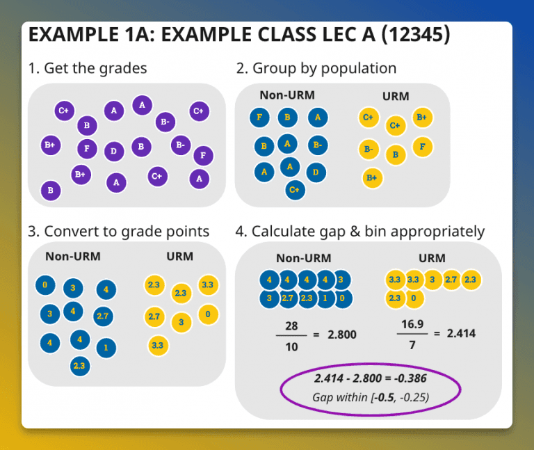
How the math works
The diagram below shows how the behind-the-scenes calculations work to determine where particular sections should be displayed on the charts.

